The purpose of this process was to conduct research and develop a redesign of an existing layout, and redesign it to make it more functional. I decided to focus on the UR SLC mobile app. Based on information made available through previous user testing and interviews, it was made clear that many students had difficulty navigating the UR SLC app, mainly due to its unclear labeling and lack of affordances. This redesign will attempt to streamline content and consolidate relevant information in an easy-to-understand manner. The agenda will also be adjusted to make events more visible, which will fix a glaring issue the app currently suffers from. Additions will be created to make sharing events to external apps easier, as well as the inclusion of a feedback section to developers/tech support for the app.
The application prototype can be found by clicking the following link:
https://xd.adobe.com/view/a0096c85-cf5c-484b-9188-d9bc292326e2-f55a/?fullscreen
https://xd.adobe.com/view/a0096c85-cf5c-484b-9188-d9bc292326e2-f55a/?fullscreen
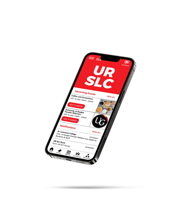
Since it is an app associated with St. Lawrence College, the school's red colour must be utilized for branding purposes. This redesign will attempt to minimize the superfluous text, and create affordances to help guide students through the app for a seamless navigation. A large focus of this app will be helping students locate events and set reminders easily, as well as providing them an area to leave comments and feedback about said events, and the app in general.
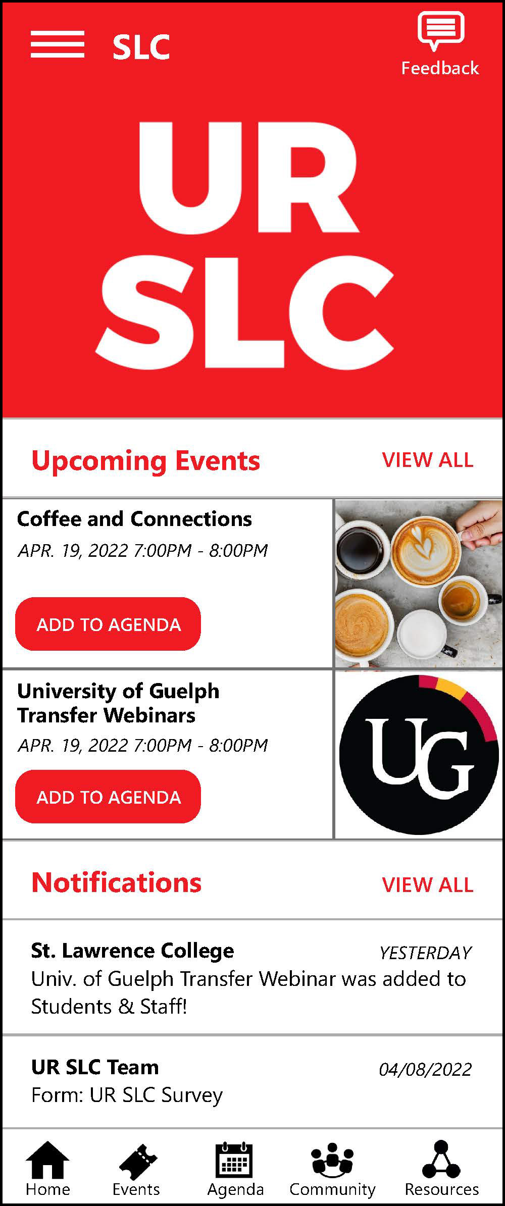
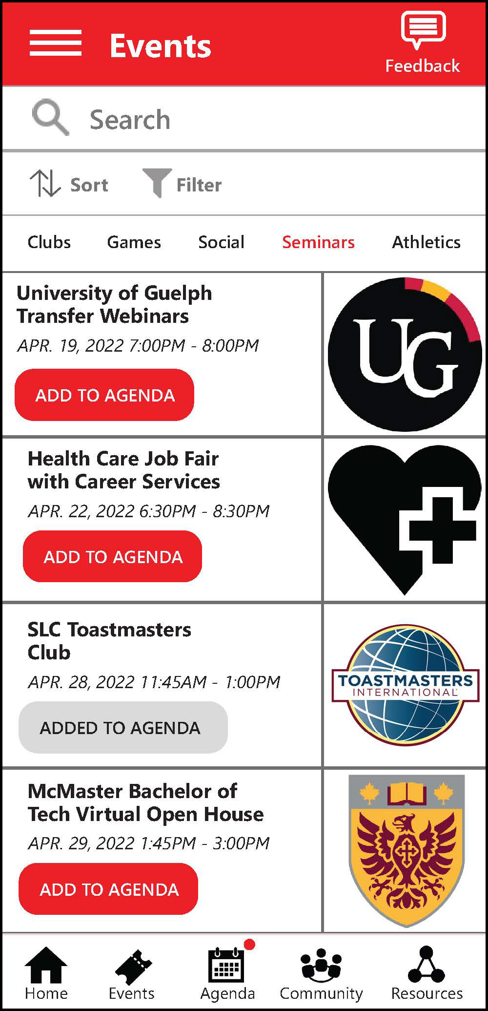
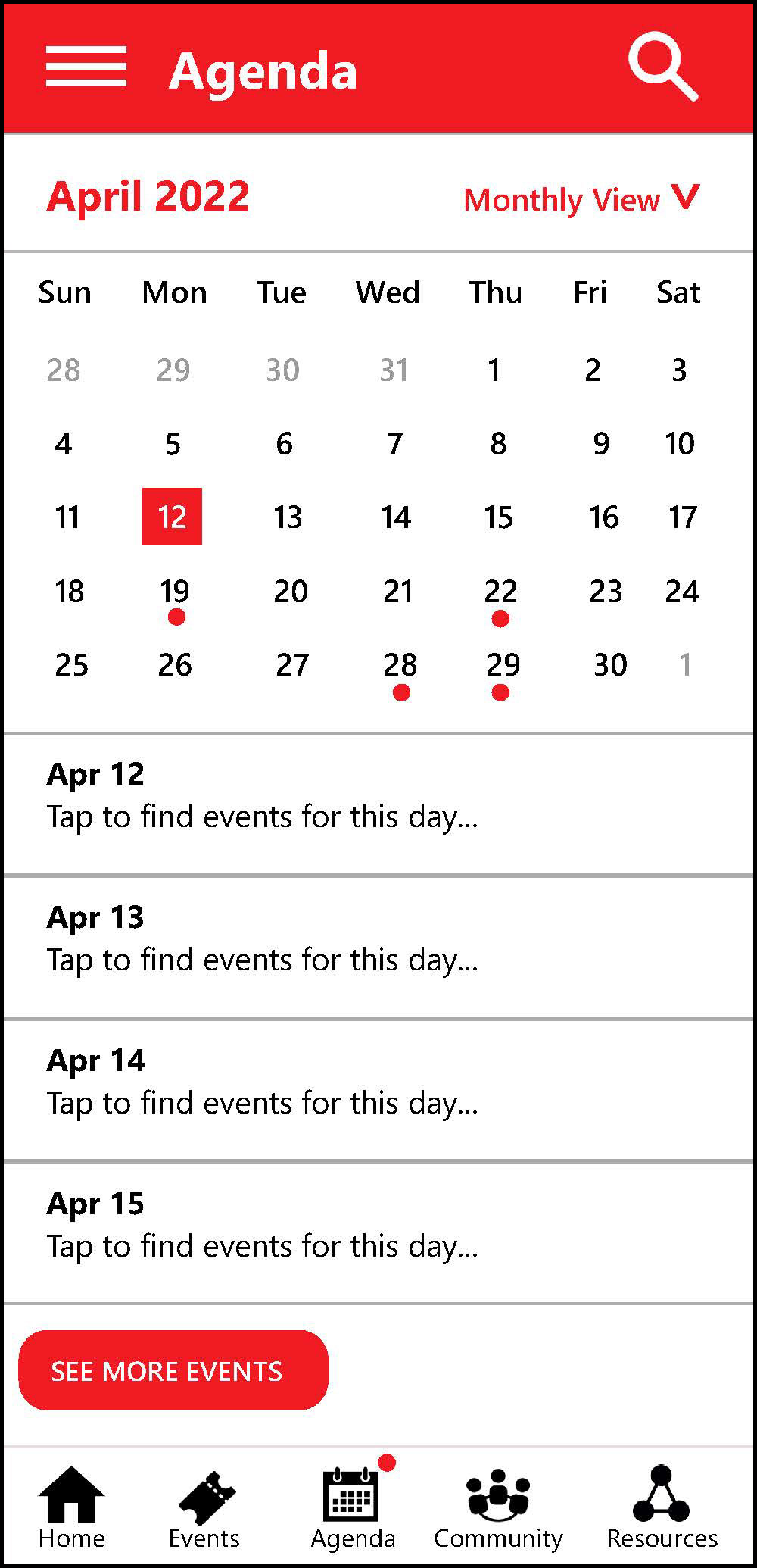

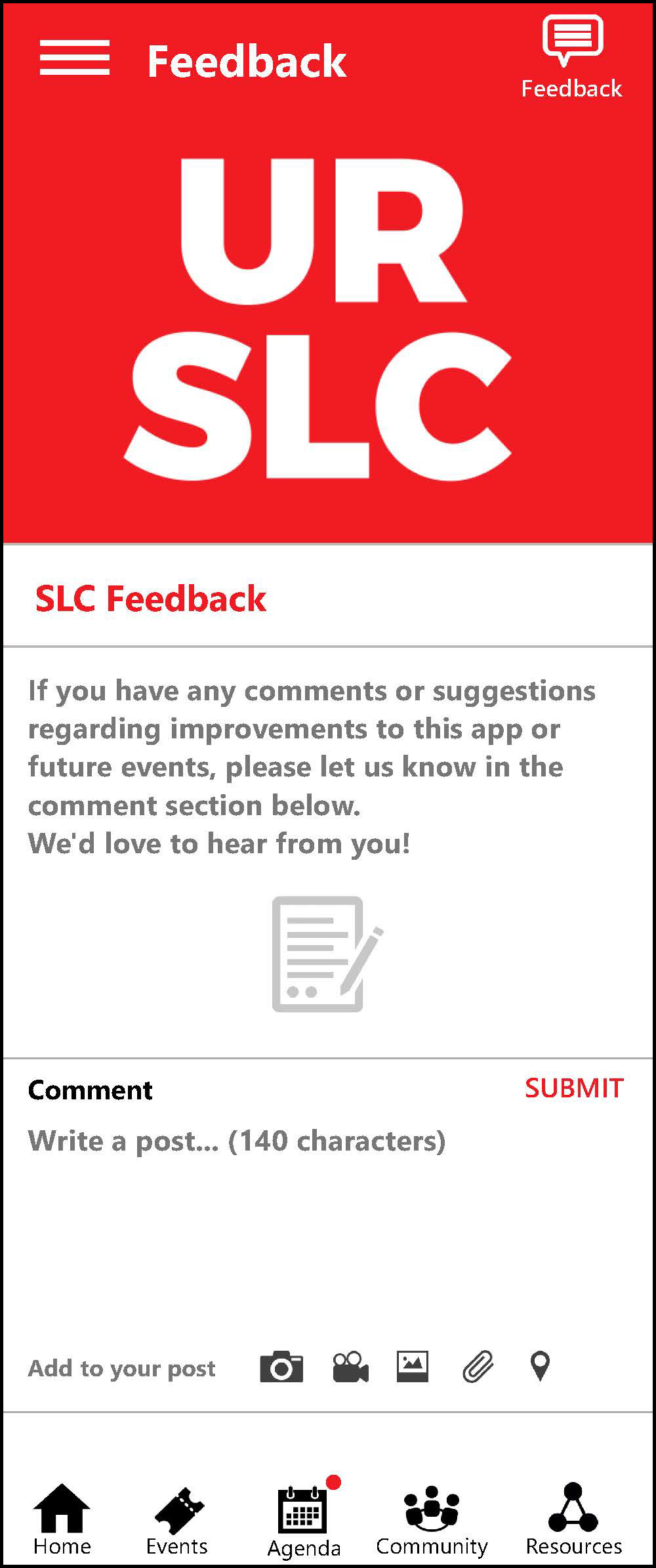
An overview of the essential pages users would encounter.

This is a persona of the ideal audience for this application redesign. The decisions made will keep this person in mind.

This is a journey map, which charts the user's experience as they use the application. This is a useful step to do before beginning the redesign, as it informs where many areas can be improved.