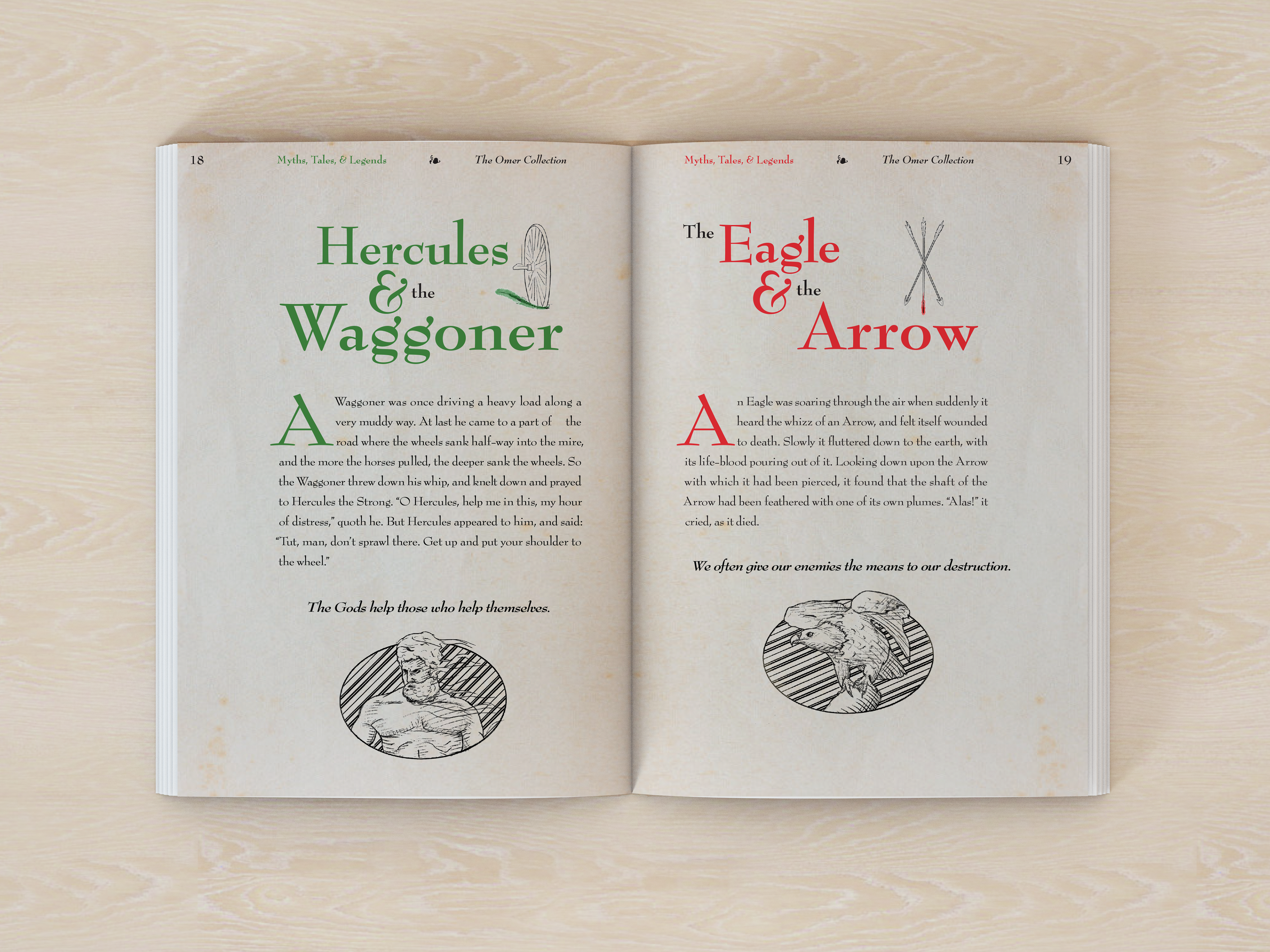
The objective of this project was to reproduce two fables from Aesop’s collection in a design reminiscent of the classical style. Ideally, the design is meant to be indistinguishable in experience from reading a legitimate classic book of fables through its layout, font choice, and overall design conventions. Those conventions include things such as a limited text area, spot illustrations, and particular font choices.
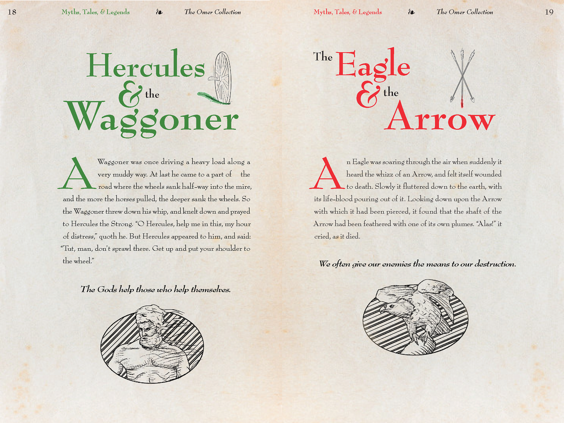
For the cover of the book, a simple but decorative approach was taken. In that time period, leather and parchment were very common materials used in the production of books, so a similar type of leather texture was used for the front of the book. To further match the classical style ornamentation, a clover-like pattern was created and used as a repeated element in the background. The illustrations are in a classical medieval style where heavier line work and cross hatching are used more frequently. The illustrations were designed to be relevant to the story, referencing the most important elements of the fables.